< Work

Ethena Ethics Hotline
How might we design a misconduct reporting experience that makes reporters feel safe?
The Ethena Ethics Hotline allows employees to report misconduct while also giving HR administrators a portal to manage those reports. In a market saturated with clunky, outdated, and impersonal reporting systems, our goal was to differentiate with an empathetic, intuitive experience that built trust from the first click.
After conducting user research with individuals who had reported misconduct in the past, I co-led the design of the hotline from initial discovery calls, competitive analysis, wireframes, high‑fidelity mockups, usability testing, and launch. The resulting feature became a standout selling point during sales demos and helped position the company as a leader in the ethics & compliance space.
Tools
High Fidelity Mockups - Figma
Initial Wireframes - Miro
Research & Testing - Moderated Usability Tests & User Interviews
Team
Lead UX Designer & Researcher - Alexandria Williams (Me)
Principal Product Manager - Kim Blackman
Copywriter - Alexis Rhiannon
Engineering Manager - James Falisgard
Engineers - 4
Discovery
Step 1: User Interviews
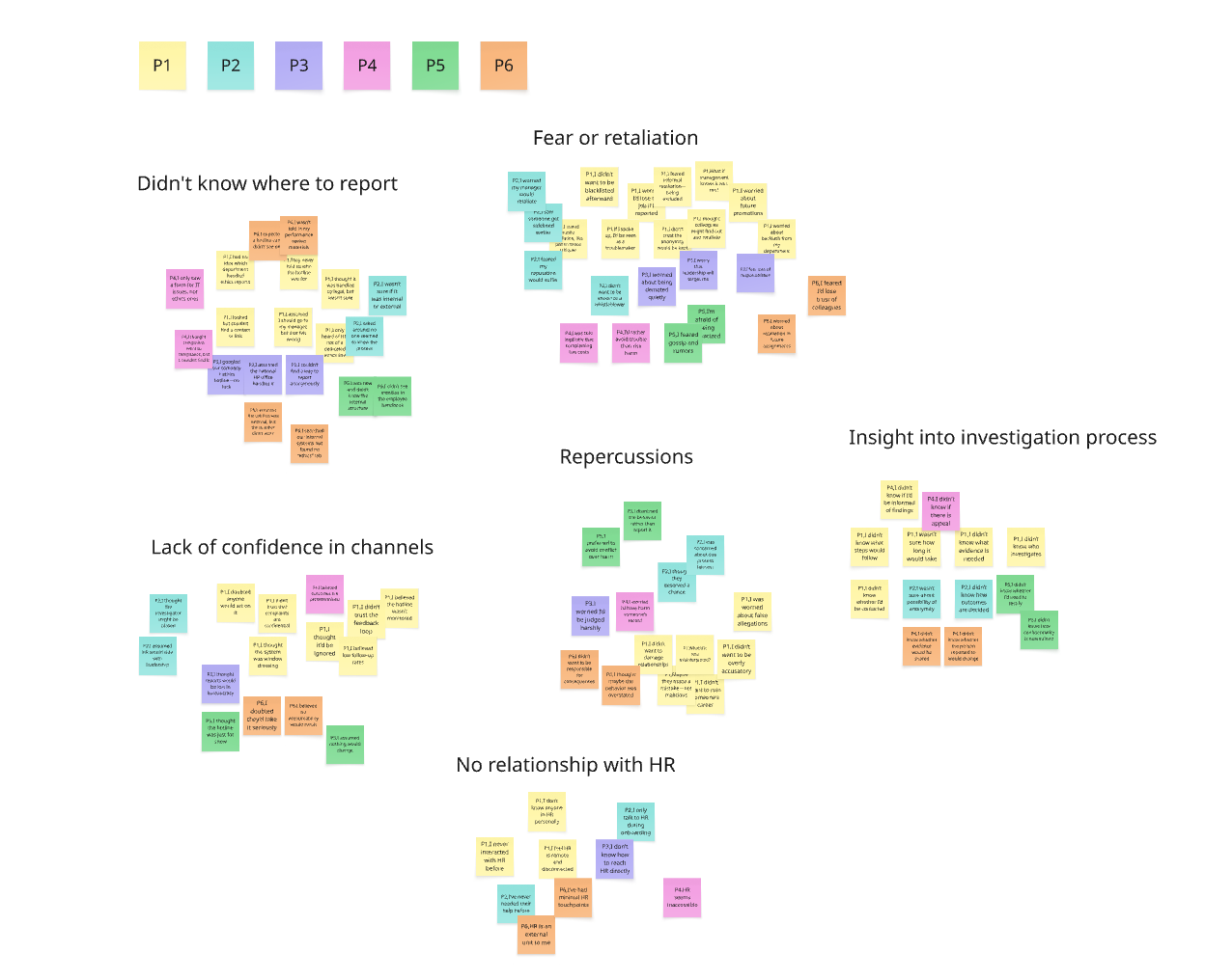
Kim (PM) and I started the project by listening. We scheduled 15–20 minute conversations with individuals in our network to better understand their experiences reporting misconduct at work.
These conversations revealed just how emotional and complex the reporting process can be. Common challenges included:
Fear of retaliation
Uncertainty about what would happen next
Confusion around where or how to report
Limited or nonexistent relationships with HR
These insights became the foundation of our design direction, it was clear that every screen, every word needed to build trust.
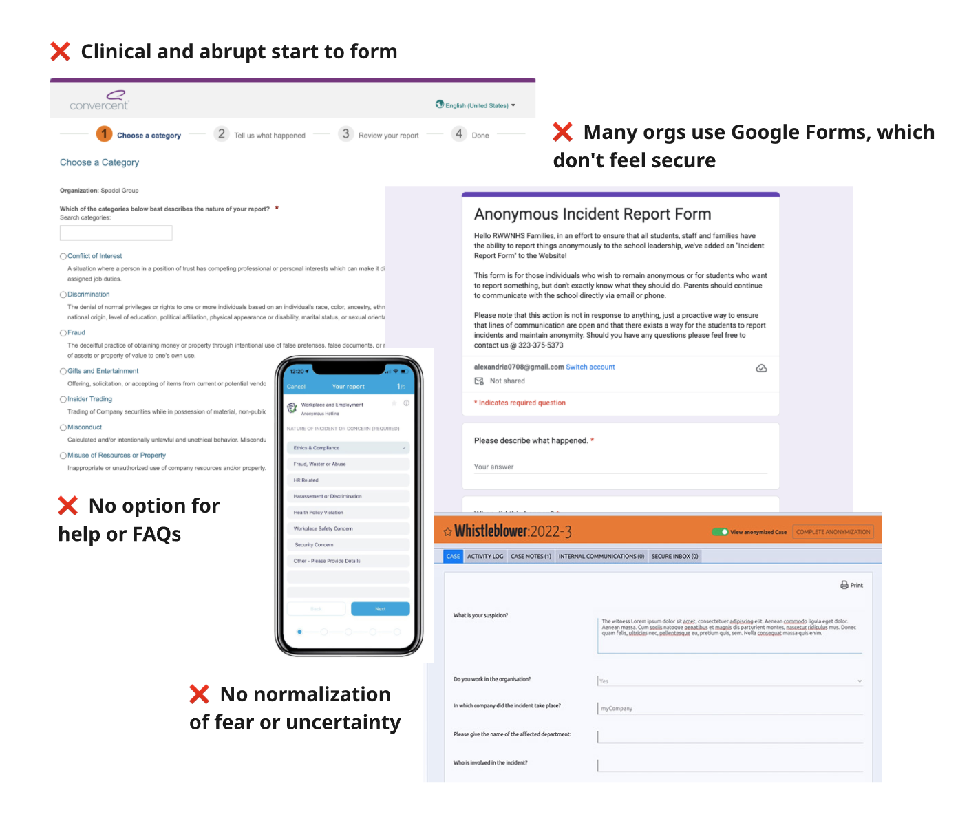
Step 2: Competitive Analysis
With many ethics hotlines already on the market, we conducted a competitive audit to understand the landscape, where others were succeeding, and more importantly, where they were falling short. This research also helped us define MVP requirements for our own feature.
UX Opportunity
Across the board, the UX of existing hotlines felt cold, transactional, and disconnected from the emotional realities surfaced in our user interviews. Many were overly minimal, failing to offer the reassurance, guidance, or tone that makes users feel truly safe. This gap represented a major opportunity to differentiate.
Design Optimizations
Preliminary interviews and market research gave us clear insight into user needs and aided the design phase of the project.
FAQ Landing Page
Based on preliminary research, we knew it was critical to the employee journey that the experience did not drop users directly into a form. Instead, we designed a landing page that featured common FAQs to acknowledge the emotional weight of reporting and start building trust from the very first screen. This page was carefully crafted to anticipate user concerns and help put people at ease before they began their report.
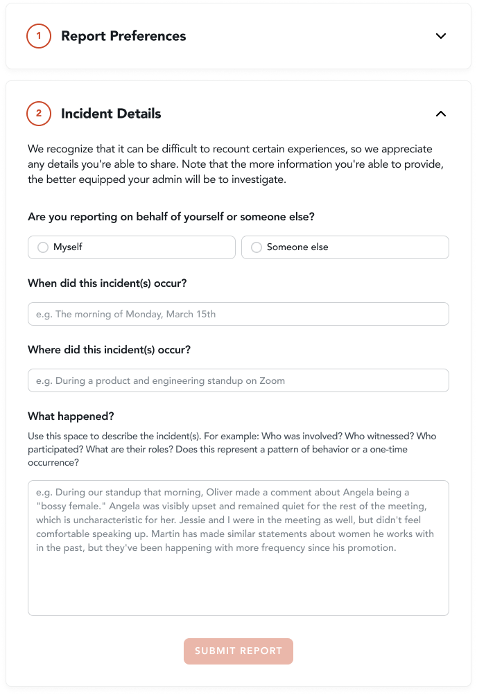
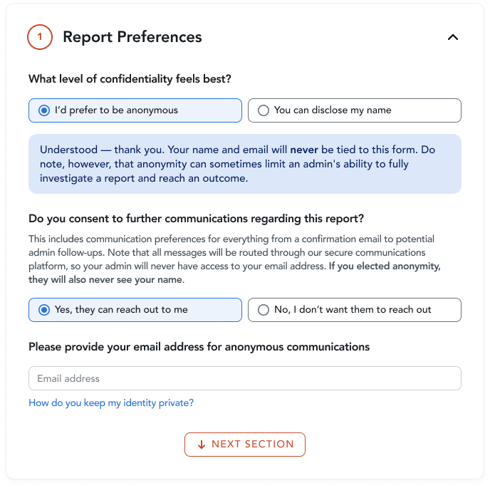
Guiding & Conversational Form
The reporting form was designed to feel approachable and easy to navigate. We used placeholder text and contextual callouts to guide reporters on the kind of information that would be most helpful to include. This approach gave users clarity without feeling prescriptive, especially in fields that touched on sensitive or emotional content.
Design of Language & Tone
Tone played a critical role in building trust. We wanted the tool to feel human, not clinical or detached like many competitors. To ensure this, we collaborated with a copywriter to shape language that reflected care, clarity, and emotional safety throughout the experience.

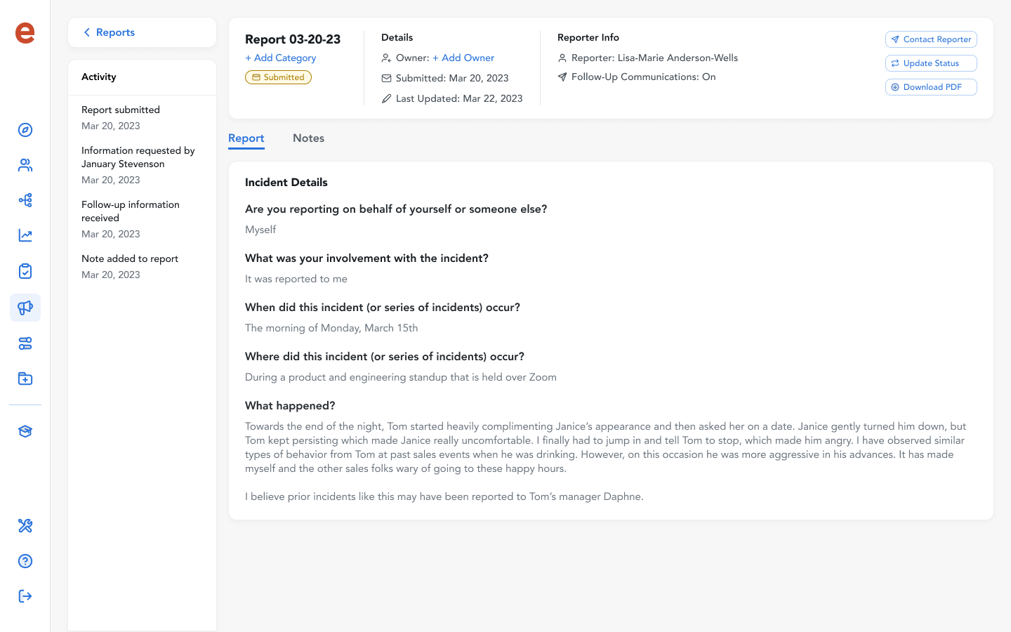
Admin Portal
In addition to the reporter-facing experience, we designed an administrative dashboard for HR and compliance leaders. This interface allowed admins to:
Review incoming reports in a clear, organized format
Respond to reporters through a protected two-way communication channel
Track status and add internal notes for ongoing investigations
The admin side balanced functionality with empathy, helping leaders manage sensitive issues responsibly and with the context they needed to take action.
Testing the Hotline
We conducted usability test sessions with both reporters and administrators to validate our early designs and uncover opportunities for refinement. These findings when into final design iterations before launch.
Reporter Findings
Participants responded positively to the FAQ section:
Found it helpful in addressing common concerns
Some users skipped it initially, but returned to it while filling out the form when questions came up
We also uncovered an important usability issue, that we addressed in subsequent iterations:
Email and anonymity confusion:
Reporters were unclear how providing an email address could still protect their anonymity
Admin Findings
For HR and compliance leaders, the process of reviewing reports was also emotionally charged. They emphasized:
A strong desire to handle reports with care and due diligence
The need for customizable content, particularly in the FAQ section, so they could:
Add company-specific language
Set clear expectations around investigation processes and timelines
Market Feedback
After launch, we closely monitored feedback from sales demos and client conversations. Our goal was to design a human-centered reporting tool that built trust from the first interaction. The results showed we succeeded:
Prospects consistently highlighted the UX as a standout during sales demos
The feature became a key value-add for upselling to larger enterprise clients
Helped position the company as modern, empathetic, and aligned with evolving workplace expectations
“This is so much more intuitive than what we’re using now.”
Post-MVP Iterations
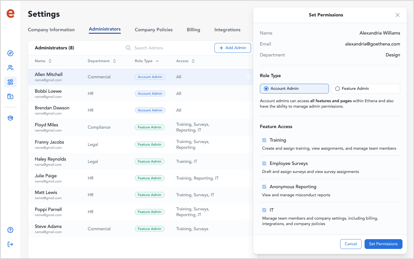
Advanced Permissioning
After launching the MVP, we received positive market feedback, but also identified key feature gaps. One critical gap was the lack of a robust permissions structure. Initially, all admins had access to everything. Given the sensitive nature of hotline reports and organizational norms (where only select roles handle such cases), this posed a significant risk.
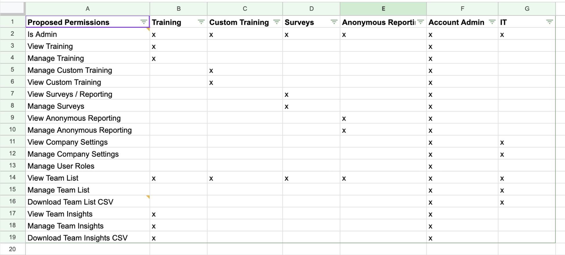
Approach
I collaborated with engineers to define a new permissions structure, mapping user credentials to specific actions and feature areas across the application. It was important to design a system that not only supported the reporting hotline but also scaled effectively across all user types and functionalities.
Outcome
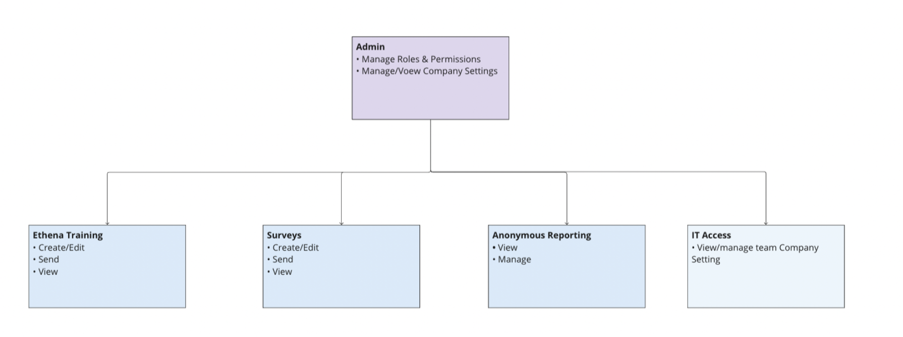
The new permissions model introduced a clear hierarchy that aligned with organizational workflows and security needs. By defining specific roles, we gave teams more control over who could access sensitive information, without compromising overall platform usability. This not only solved the immediate challenge around hotline access, but also created a scalable foundation for permissions across future features. The structure included:
Account Admins: Full access across the entire platform.
Feature Admins: Restricted access, limited only to specific features they are responsible for (e.g., hotline, training, reporting).
Final Thoughts
Leading the design of the Ethics Reporting Hotline deepened my belief in the power of listening. Even short conversations with users surfaced insights that shaped the entire experience and differentiated us in the market.
It also reinforced the importance of designing for real-world power dynamics. Especially for marginalized groups, the difference between a cold, confusing interface and a human-centered one can mean feeling safe enough to report — or staying silent.